Wednesday, April 30, 2008

Bombshell Bree

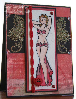
I started this card by stamping, embossing, coloring and Stickling this pin-up from Bombshell's Bombshell Angel set. As soon as I finished, I said, "Hey! I made Bree Van De Camp!" That's the Mayfield family's dirty little secret! You see, we don't have television, for many reasons. Most people are shocked speechless when they hear this. I think many people think TV is right up there with oxygen on the hierarchy of needs. We do have Netflix, though, and we get the Desperate Housewives DVDs. We're a little bashful about admitting that we like this shameful, shameful display of bad behavior, but we do. So there you have it. I told you mine, anyone care to share their embarrassing little secrets? I think I'm going to do the whole cast out of Bombshells, won't that be amusing? And no, I'm not normal. I never told you I was!

The card is all SU! paper: Basic Black, Brushed Silver, watercolor and Whisper White. The ink is VersaMark. Accessories include silver and Black Diamond Stickles, a little gem, Prisma pencils used with baby oil, lace, ribbon, and cord, silver and Holographic ep. I colored her bodice with Sakura's black glaze pen before I used the Stickles, it won't cover with just the Stickles, especially on white paper.

Tuesday, April 29, 2008

Artistic Outpost Playtime Reveal

Here is the full sized version of Sunday's sneak peek! It's on sale TODAY, and tomorrow. It goes back to full price on the first of May, so if you like it, and you want to save some of your valuable stamp budget, head on over to Artistic Outpost and pick up this and the other new set, called Adventure. I stamped this little boy in Aged Mahogany on SU! Confetti twice. He comes in the frame. I sprayed the frame layer with my homemade sparkle spray, then cut the little boy out of the other image so he didn't look like he was suffering from some horrible skin disorder and popped him up with foam tape. The whole frame is popped up off the designer paper as well. All the DP here is Hot Off The Press, including the word cherish and the ribbon. I added lots of buttons, Primas, punches and Crystal Stickles. Three of the five Primas are dyed with Baroque Burgundy re-inker. It goes very well with the Aged Mahogany, and I don't have that re-inker, so I use what I have! This card is heavily aged. I didn't do any physical distressing, but there are layers and layers of ink here. I used the Stardust pen around the sentiment layers, and the center of the burgundy plastic thing is a glue dot sprinkled with Dazzling Diamonds.

Thanks for stopping by! I love reading your comments and visiting your blogs. I didn't realize just how much fun this would be when I started!

Monday, April 28, 2008

Long Eared Bunny

I didn't have time to work with this Creative Play Stamps set before Easter, and I was disappointed because I didn't want to wait a whole year to use it! We have been having some beautiful spring weather, so I thought I would celebrate that with this card. We have both cottontails and jack rabbits in abundance here in the Oklahoma Panhandle, so I see bunnies every day! My base is Chocolate Chip, and the designer paper is retired Spring Flowers from SU! I stamped the bunny in Brilliance Chocolate on Confetti card stock and embossed it with Holographic ep. I sponged some edges, slapped on a ribbon slide and tied a couple of extra pieces of ribbon up in the brown grosgrain and called it done! This was a fun, easy card to make. All ink pads and re-inkers are on sale at Creative Play Stamps for 20% off until May 11th! The Glimmer Mist Sale ends tomorrow...

Sunday, April 27, 2008

Artistic Outpost Sneak Peek!!

Here is a tiny peek at one of the stamps in Artistic Outpost's new Playtime set! Isn't this little boy adorable? If I understand correctly he is one of the DT member's husbands. There's another set debuting at the same time, it's called Adventure. Both of these sets will be on sale for 15% off on the 29th and 30th, which makes them $9.35. That's one of the best deals in stamping right now if you ask me. These are big sets and a terrific value at the regular price of $11. Buying them on sale sort of makes you feel like you're getting away with something!;) How often do you get to feel that way these days? Click here to see a list of other DT member blogs so you can see what they've posted. Maybe you can figure out what the new sets will look like!

Saturday, April 26, 2008

Bombshell Stamps~Butterfly Queen

This little pin-up reminds me of a Las Vegas showgirl. I wanted to work with this Daisy D's paper, so I dressed her in red. I started by stamping her in VersaMark and embossing her in detail black on Canson's watercolor paper. I almost always watercolor this way because the raised edges of the embossing help me control the watercoloring a little better. I need all the help I can get to make mine look good! I usually use markers, then smear them around with a wet brush. I start with the lightest color and add depth with darker colors as I go. I use four or five different brands. I like SU!'s Blush Blossom for skin, if you're doing a white gal. I'm working on other shades of skin, but I'm not very good at them. I use Bliss Blue as my grounding color, that's the little outline of the image. It helps keep it from looking so stark, since there's no background here. I always mix a little Radiant Pearls with my water, so the whole image has a nice shimmer.

The ribbon is Basic Gray Color Me Silly. I really treasure this ribbon, but I am working on not hoarding supplies. The more I use, the easier it gets, why buy it if you're not going to use it? The heart button is from WalMart. It's very fat, so not great for a card, but I liked the look of it, so I used it anyway. This one will cost me dearly to mail. I used Art Institute Glitter in Lion's Mane for the wings. It's a beautiful orangy gold from one angle, and a complex green from another. I used SU!'s Heat and Stick powder, which I have never had much success with, I'll try something else next time. These wings are too detailed for the H&S to give pleasing results.

Thursday, April 24, 2008

Gatefold Card


Talk about easy! This gate-fold card is from Creative Cuts and More. All I had to do was pick out the colors! There are dozens and dozens of paper choices. You choose whether you want Bazzill Criss Cross, Smoothies, or any number of other choices first. Then you get a drop down menu and you click on the color you want for the card, and the color you want for the band. Everything arrives pre-scored, perfectly cut, and ready to embellish. This is such a blessing for me because I am so challenged with measurements, I can't even begin to tell you. This way I can enjoy a different fold without the trial and mostly ERROR of doing the cutting and scoring myself!

For the band, I simply layered a big brad and three silk flowers. I used the brad to hold the band together, there's no adhesive on it. I added the little gem myself because the big, empty brad just screamed for it! All the glitter is on K & Co. adhesive rub-ons. I wanted green glitter, and my only green was SU!'s Glowing Green, which is just about the worst glitter I've ever seen. It doesn't even sparkle. What were they thinking, I ask you? Matte glitter? Isn't that an oxymoron? Let me just tell you that I was not one bit surprised when the Halloween Glitter Stack was retired! I guess SU! can't be perfect at everything. They do make Almost Amethyst and Chocolate Chip card stock, so that makes up for the occasional glitter snafu, don't you think?

The inside is a stamp from A Chemistry With Paper's All Year Bag Toppers. This might be the biggest set I have. It is so versatile, I reach for it all the time! I embossed it in SU! pink EP. The sentiment is separate from the frame, so you can use whatever words you need for the occasion. I added a little glitter around the edge. Leave no surface unglittered, that's what I always say!

Wednesday, April 23, 2008

Humble Pie

A few posts back, I bragged shamelessly about my brilliant discovery of using Stickles to glue on dew drops. I was SO impressed with my cleverness. Well, now I have a distended belly because I just had to eat a large helping of humble pie! They ALL fell off! Stickles will not stick dew drops down, take it from me, I have lots of forlorn looking cards with weird, flat Stickles spots and NO DEW DROPS! Back to Crystal Effects for me. I think my mother mentioned something about bragging at some point during my childhood, but did I listen?

This card is one of my favorite combos, turquoise and brown, The brown is SU! Chocolate Chip, and the turquoise is Broken China. How happy I was to discover this Crafty Secrets DP that goes so well with those colors! The stamp is from Artistic Outpost's Happiness plate. New plates are coming soon, so check back often, I'll LYK as soon as I have some details. To make the chipboard, I laid it on my desk and pressed the Broken China pad to it. Then I followed that with a few shots of homemade sparkle spray in Caspian Sea. (One jar of Radiant Pearls plus four ounces of cheap hair spray.)

Tuesday, April 22, 2008

How do you blog? And where is Teresa K?

I'm just flying by the seat of my pants here! If it weren't for my good friend Veronica, Art of Creative Play Stamps, and Lisa, the DT coordinator for Artistic Outpost, I couldn't do any of this! I have some questions:

1. How do you respond to comments? Right now I open the email notification, click on the person's name, then click on their blog in their profile. Something tells me there has to be a better way! There are problems with this method! Not everyone has their blog in their profile. Why is that?

2. What do you do when someone comments in another language, or invites you to look at their blog, which is completely in another language?

3. Where is TeresaK? Her blog is gone, yet she still leaves lovely, thoughtful comments on my blog. I used to enjoy her blog. She's an excellent writer and a great stamper. Are we not supposed to get attached to each other? Is it odd for me to worry about someone I don't even know?

Divine Design 2008~February

This is my February page for the Divine Design 2008 Bible Verse Challenge over on SCS. I finally remembered that I had this book of vellum scriptures from DCWV, and went and hunted it down. I thought I'd use this verse first because peace is one of the main reasons I'm a Christian. Peace comes standard as part of the benefits package, no negotiations required. I'm a fairly high strung person, (those who know me well are laughing at my use of the modifier "fairly"), and since I developed a personal relationship with Jesus, I have been A LOT more peaceful!! Those of you who are moms know that when mom is at peace the house is at peace!

I used My Mind's Eye Bohemia paper and rub-ons, Bazzill, brads, gem, Creative Play Stamps butterfly from Swirl Garden and the tiny turquoise butterfly is from Artistic Outpost's Happiness plate. Also here is AI glitter in Blue Boy, Key Lime Pie and Chestnut Brown Glimmer Mists, and Broken China Distress embossing powder & ink. I highlighted the windows with the stardust pen. After I finished this I thought it looked like this horrifically-sized butterfly was going to attack the house. I still think it looks that way. I guess I'll just call this my Alfred Hitchcock page, everyone should have one, don't you think?

Monday, April 21, 2008

Altered Box


So let's just say that I don't alter a lot of stuff. However, I'm quite enamored of the idea, and am an avid collector of things that some day, supposedly, I will alter. This is one of the things I set aside with intent to alter. So what we have here is a common jewelry box from Soft Surroundings. (The earrings are marvelous!) I painted it with Adirondacks Lights Paint Dabber in Willow. I love this paint because it dries VERY quickly, in a few (as in three) minutes. I painted the inside too, just for prettiness' sake. Then I used my SU! slit punch to make a scallop border from some Crafty Secrets paper, and glued that on with redline tape. This made the lid quite a tight fit, so keep that in mind if you try this. Then I used redline tape to put the GORGEOUS (yes, I'm shouting, can't you hear me?), trim on the edge of the lid. This trim is from The Embellishment Studio, where I will be a guest designer this summer. The lilies are from there also. The paper flower was the most time-consuming part of this project. I used Stylized Flowers from A Chemistry With Paper to make it. I embossed it five times on the index page of an old encyclopedia, cut them all out, and sprayed them with Key Lime Pie Glimmer Mist. I'm pleased with the results, and I don't think it took me more than an hour to make. I spend an hour on most of my cards, so this is pretty gratifying, as it will be a longer lasting item. I hope! I'll have to think carefully about who to give this to. It has to be someone who will give it the respect and adoration it so clearly deserves;)

Sunday, April 20, 2008

Just Ducky!

As you can see, I still had all the product from yesterday's card on my desk when I made this. This adorable duck face is from A Chemistry With Paper's Bunny and Friends set. The Happy Spring sentiment came with it. Next time I might try my hand at watercoloring this, I think even I couldn't mess it up too bad! The shaped piece the duck is on is from Creative Cuts and More. It is one of the parts from the Cupcake Box-it's the die that keeps on giving! I didn't use it on the box, but there was no way I was going to throw it away! It's on Curious Metallic card stock and I love that stuff!!

I made an exciting discovery recently, and used it on this card. You've probably already thought of this, but I came up with this completely on my own, so it's original to me! I glued the clear dew drops on with Aqua Stickles!! It looks so cool! You can see the color and the glitter through the drops, I think they actually magnify it a little bit! I will be doing this a lot, since I have about a million clear dew drops and close to 30 Stickles!

Saturday, April 19, 2008

Bright Hello

Maybe too bright? When I first colored this Big Hello, it was so bright I just had to put it away for a couple of months. I got it back out yesterday and pulled lots of color off with a wet brush, but it was still too bright. Then I went over it with Lumiere. Then I sprayed it with two different Glimmer Mists. One is a homemade brew, and one is Key Lime Pie, which is on sale here! I used Bazzill as my base, added a bit of My Mind's Eye under the main image, some Primas and a Bazzill silk flower, some ribbon, a few brads, and called it good! Well, good enough.

Friday, April 18, 2008

Bombshell Stamps~Hearts On Fire

It took me a while to go through my paper stash and find just what I was looking for to showcase this set. I finally settled on some Daisy D's and FontWerks. There's also a little Basic Black and Confetti. I stamped the heart in VersaMark and embossed in detail black. Then I colored it with Baroque Burgundy, Creamy Caramel and More Mustard using the pad lids and a wet paintbrush. Next, I dabbed a sponge into my Aged Mahogany Distress pad, then dampened it and added the messy stuff. After that, I gave it a couple of shots with my homemade sparkle spray in Candy Apple Red. I also sprayed the chipboard with the same spray after sponging it with Aged Mahogany. On the black ledger paper, I embossed some of the flames with Ranger's Holographic. The word "treasure" is from one of those MM tins. I haven't used mine in over a year, and ran across it while I was rummaging around in my stamp room. There are LOTS of words, in different fonts, so I think I'll leave it out on my desk for a while. Everything old is new again, you know! Stay tuned for new stamps from Bombshell,Shannon has all kinds of ideas in the works!!

Thursday, April 17, 2008

Artistic Outpost~Home~Plus a secret!

This cool barn is one of the images from Artistic Outpost's set, Home. I love the detail, and wanted to use the whole image, which doesn't leave a lot of extra room on the card. To add a little punch, I embossed it directly on some of SU!'s old designer paper. The base is Bazzill, the ribbon American Crafts, and the clip is SU! Hodgepodge Hardware in Aged Copper. There are several layers and the three top layers are popped up off of the Chocolate Chip layer. Ready for my secret? I have a new AO plate sitting on my stamp desk-I haven't even cut into it yet. I can't show it to you just yet, but I'll try to come up with some good stuff to show you when we get the O.K. to reveal!! I hope you'll come back and check it out! Also, if you are interested in trying some AO stamps, four sets are on sale this month for 20% off!

Wednesday, April 16, 2008

Peace of the Lord


I promise these colors match in real life! I debated as to whether I should even post this, because some of you will think I've taken complete leave of my senses, especially sight! This is another one from A Chemistry With Paper's Spiritual Sentiments. I used the medallion again, with another sentiment, I love the font in this set. This is a small card. I bought a package of American Greetings note cards at the $ store, and have been covering them. The insides are blank, and they come with envelopes, so it's a real bargain. The paper here is Bazzill, Prima, and MME, plus Whisper White. The ink is Aquamarine Chalk. There's also pretty satin ribbon from Flourishes, brads, and some Aqua Stickles.

Tuesday, April 15, 2008

Flourishes~Lace Heart


I won this beautiful set from Flourishes, it's called Lace Heart. I embossed the heart in SU!'s Antique Gold Glaze, which is retired now. That's a shame, because I love the look of it, I'm sure there's an equally nice gold out there somewhere just waiting for me to discover it. This is a chunky powder, so you get a less defined look. I also like the mellow color, it's not a bright gold, hence the "Antique" in the name, I assume. The designer paper here is from Prima Marketing's Poetry Collection. There's also a little touch of Bazzill, some crochet thread and a few bits of bling. The heart is up on foam mounting tape for a little dimension.

Monday, April 14, 2008

Happy Spring!

It's warm! It's warm! 84.6 degrees out right now, so I am celebrating with a spring card. I made this in December or there abouts, and just have never posted it. Even though it's warm out today, I feel kinda rotten, so I think I'm going to go curl up with a book instead of stamping. *insert shocked face here* I went to the doc and he thinks I have bursitis in my hips. Isn't that for old people? Anyway, he gave me a shot of cortisone in my right hip, now we wait to see if it gets better. I think the idea of having a middle age malady makes me feel like I'm about a hundred years old. Luckily, there's no chocolate or ice cream in the house, so I can't have a BONA FIDE pity party, but I'll do my best! *hobbles off to find shawl and rocker*

Sunday, April 13, 2008

Divine Design 2008~January


This is my January entry for the Divine Design 2008~Bible Verse Challenge over on SCS. You can join any time, as you can clearly see, I'm behind myself! The idea is to have a place for a monthly memory verse. Stampers are doing all sorts of things like boxes, cards, bookmarks, ATCs, mine is a book from Prima Marketing. If you want more details about the book, scroll down a couple of weeks. I got my verse from one of the church bulletins. I liked this verse, and thought it was a good one for me to keep in mind because I am a mother, aunt, and junior high and high school teacher. My book is mostly My Mind's Eye Bohemia, which I just think is great stuff! Working with double sided designer paper on a large project like this makes the whole thing SO easy, if you need another color or pattern, just turn one of your sheets over! VIOLA! I used Polka Dots and Flourishes from Creative Play Stamps on the green oval behind the scripture oval. This set goes well with Bohemia because Bohemia is full of polka dots and flourishes! This page has lots of subtle shimmer. I embossed the dots in Ranger's Holographic, my very favorite ep! My goal is to have March's page ready to post next Sunday, but I can't guarantee it. I have a hard time rushing this project, I want to make sure each verse is exactly what I need to work on, and that the pages are good enough to honor The Word.

Saturday, April 12, 2008

Chemo Angel Card

I'm a Card Angel for Chemo Angels, and my patient loves angels, so I made this for her. I bought this small two stamp set from Crafty Secrets because I did not have but one tiny angel in my entire stamp collection! I'm not much of an angel collector type, and I never used an angel on a card with my other patient because Chemo Angels tells us, "Go easy on the angels, Angels!" In other words, not everybody wants to be inundated with angel cards, figurines, pins, whatever. I liked this sophisticated Art Deco style angel, and is she ever beautiful embossed in Ranger Holographic! I stamped her first in Celery Craft, and did the same thing with the chipboard photo corner, also from Crafty Secrets. If you are interested in brightening the days of someone who has cancer, please go check out the Chemo Angels website and to see if it would work for you.

Friday, April 11, 2008

Artistic Outpost~Happiness~Again!

Doesn't this image make you smile? It's like when you are in a public place and there is a group that is so obviously having a great time you just have to smile with them, even if you don't know what they are laughing about. When I see this, I have to smile. This image is from Artistic Outpost's aptly named Happiness sheet, along with lots of other beautiful, smile making images! I used Cosmo Cricket's Jitterbug line here, that's where the lovely frame came from. I rarely do a card without bling, so I used my glue pen to outline the inside of the frame, directly on the image, and poured on the Martha Stewart Brownstone Glitter-so pretty! It's not an iridescent glitter, but I still love it! I stamped the image in Tim Holtz Distress Ink in Broken China. I love these distress inks. I only have two colors, but I plan to collect more. I think they work especially well with Artistic Outpost images. If you like AO images and want to give them a try or add some to your collection, they are giving 20% off on four different sets right now. They are already a screamin' deal, this just makes them irresistible! One of the sets is Singing Cowboy, which I have used on several cards I've posted here. It's such a great set!

Thursday, April 10, 2008

A Chemistry With Paper~Spiritual Sentiments


One of my favorite things about A Chemistry With Paper's stamp sets is that they have a wide variety of sentiments to choose from, and this one is no exception. Isn't the font on this sentiment gorgeous? It's also a pretty big set, so I feel like you get a lot of bang for your buck. This is primarily a sentiment set with some pretty little elements added in, like the medallion here. I embossed it in Ranger's Holographic embossing powder, and did the sentiment the same way. I colored the medallion with markers and smeared with a wet paint brush. It did not smear as well as usual, and the reason is that I forgot to stamp the image on watercolor paper. I tell ya, there's a reason they call watercolor paper WATERcolor paper! It works better, and not just a little bit better-light years better! I made this card bright because we shouldn't just tell people we're praying for them in tough times, it's good to pray during the bright times, too. I don't work with brights very much, but I love pink, and I think Gable Green and Basic Black look good with the pink. I can't remember which color pink this is, isn't that shocking? I need some of those memory pills. Do you think they work? My main memory goal for the last 17 years is not to forget my children. So far, I have never left any of them behind!

Creative Cuts and More~Cupcake Box


I was asked to share some other views of this cupcake box so that you could see what made it so special! It has a beautiful cut-out lid with an acetate window. All the details are below on my blog.

Wednesday, April 9, 2008

Bombshell Butterfly

If you think Bombshell Stamps is all about the pin-ups, think again. They have a wide selection of tattoo style stamps as well. This is good, because I think tats are very interesting, and some of them are very beautiful, but I am both too conservative and too chicken to get one myself! Besides, my parts aren't all exactly where they used to be, and I'm pretty sure I don't want to draw any attention to their new locations, so I play with these stamps instead! Shannon, of Bombshell, has all kinds of exciting new stamps coming out soon, and I can't wait to show them to you! When I know more details, I'll spill, you know you can count on me!

This beautiful stamp is from the set Butterfly Queen. The main image is a showgirl style babe, and there are two butterflies and some GORGEOUS wings you can put on the girl, or use in your altered art projects. I stamped the butterfly in VersaMark on watercolor paper and embossed it in SU! Detail Black, which by the way, is retired. (This is insanity on SU!'s part-I always use detail!) I will be switching to Ranger detail, and soon, because I'm almost out. I colored the butterfly with various markers, then smeared it all around with a wet brush. Yes, smearing is my method, you can't call what I do watercoloring, that would be an insult to those who actually know how to watercolor. I added a few dabs of Crystal Stickles, if I could only have one color, this would be it. We won't mention how many colors I actually do have, but Crystal is my fave. The dew drops are from Flourishes, flower is Heidi Swapp, paper is all Crafty Secrets, My Mind's Eye and SU! Of course the distressing is Chestnut Roan Chalk.

Tuesday, April 8, 2008

Blue Boy Butterfly


I call it that because I used Art Institute's Blue Boy glitter on the Creative Play Stamp butterfly. Have I mentioned how much I adore, I mean really adore Art Institute glitter? I don't like it better than my children or anything, most of the time that is, but it's so complex. Each color is like a million tiny rainbows that somehow come together to form one color, in this case, a beautiful pale blue. Here's the way I see it: How many of life's pleasures cost $4.40 and last for years? I like an expensive cup of coffee as much as the next gal, maybe more than some, but I can horse down a double tall vanilla latte in about 15 minutes flat. A tiny jar of glitter lasts longer than 15 minutes. I know this to be true, because I've had lots and lots of jars for a lot longer than 15 minutes!

I received this award from two wonderful blogging friends, Toni and Etha, whose work I admire immensely! The idea that they would think of me for this award is a huge honor and a big surprise. I must digress here for a moment. When blogging hit SCS, I resisted for over a year. I was thinking, and please don't hate me for this, "What a bunch of self absorbed people! Why on earth would anyone want to read what I have to say about anything, and why would I want to read what they have to say?" I promise I'm not a mean person, I just didn't get it. The only reason I started a blog was because one of the companies I designed for wanted me to have one, so I started it. What has happened in these short four months is that I have made real friends, whose lives I care about, and whose art I admire. Who knew?
Here are the rules:1. You pick five blogs that you consider deserve this award for their creativity, design, interesting material, and also contribute to the blogging community, no matter what language.2. Each award has to have the name of the author and also a link to his or her blog to be visited by everyone.3. Each award winner has to show the award and put the name and the link to the blog that has given her or him the award itself.4. Award-winner and the one who has given the prize have to show the link of Arte y Pico blog, so everyone will know the origin of this award.
Here are my choices:
Amy, of Tsuruta Designs. Amy's work is the exact opposite of mine. She actually has restraint. Every card she makes is a perfect little jewel of simplicity. Her design sense is impeccable. Also, she shares the fun trips she takes around the Seattle area. I can pretend for a moment that I don't live in the dry, flat Oklahoma Panhandle when I visit her blog. I have invited myself, my husband and our three sons over to her house, she's expecting us.
Lauren, of Groppi Girl Blogs. Lauren usually works in the most soothing pastels. Her designs are simple and beautiful. I sometimes think of her work as my paper prozac, because it's so soothing, everything works together, there are no jangling YIKES! aspects to her work. Plus, she has run a half marathon, which makes her a super stud. She also has a shameless obsession with Disney Land or World or one of those, which makes her incredibly immature, I mean childlike!;)
Carolina of Carolina's Creative Pad. Carolina's work is just stunning. Layers and scallops and ribbon, oh my! She always has just the right touch for every card, her workmanship is amazing. She is also really good at describing what she does on her pieces, which sometimes I am too lazy to do.
Bev, of Savor the Journey. She designs for Hanna Stamps, and I love her fresh, fun colors and designs. I also enjoy her sunny and supportive dispostion, it's so clear in the virtual world, that you know it's real. Some things you just can't fake!
Cammie, of My Blog. Carolyn King, (Cammie), is a stamp designer and designs for other companies as well. She's making a pretty big splash in the stamping world right now, and is just going to get bigger (her spash, not her literally!). I pick her not just for her artistic ability, which is obvious, but because she still makes time for the people making little spashes, like me!

Monday, April 7, 2008

A6 Arch Window Card

This window card is from Creative Cuts and More. They have a bunch of window cards to choose from, and I wanted to try one with this beautiful owl stamp from Creative Play Stamps. When you go to the CC&M website, you first choose what you'd like them to cut, like this card. Then there is a drop down box with the dozens of paper choices available. This happens to be Bazzill Smoothies in Almond Cream. I added a quarter sheet of acetate to my card, which you could probably order from CC&M as well, they have a nicer weight than what this is, mine's pretty flimsy, but it works for this card. CC&M is a fairly new company and they are adding new products all the time. I was looking around their site last night and noticed that they have Doodlebug adhesive gems, and sugar glitter-so pretty!! I'm going to get some of both! The sentiment on this card is from A Chemistry With Paper's HUGE set, All Year Bag Toppers. The stamp is one line. The way I made it two lines is by inking it with my Cat's Eye. I first inked "Feel Better" and omitted "Soon." Then I stamped, cleaned the stamp and did the opposite. I could also have cut my stamps apart, since they are clear and unmounted, but it's a brand new set, and I just didn't want to cut it up, so I did it this way. It only took an extra minute to get exactly what I wanted.

Sunday, April 6, 2008

Divine Design 2008

Stamp_momma started this challenge over on SCS. The deal is that you make something to contain a monthly scripture. Stampers are doing various things like boxes, bookmarks, cards, or like me, a book. The idea is to have a place to keep a memory verse for each month. Because this is an important project for me, it took me quite a while to decide what products and verses I would use. I finally decided on My Mind's Eye Bohemia, one of my all time favorite lines. I wanted a verse for the cover and fretted about it for weeks. How do I choose ONE verse? I mean the Bible is a big book, and all the verses are pretty important or they wouldn't be in there! To break the inertia, I grabbed a stamp I had and just went with it, I love the verse anyway, and it's a great reminder! The book is by Prima Marketing. It came in a kit from EBB Creations over a year ago and I never could figure out what to do with it. It has a big heart cut out of the cover, and I tried to make a template and cut the verse to fit in there, but when I noticed that it resembled the work of your average four year old, I gave up on that idea. Now the back of my book has an upside down heart on it because without thinking, I just grabbed the back of the book and made it the front. I'm really such a train wreck, it's amazing I get anything done. Well, you've heard that we all have a God-shaped hole in our hearts, so I thought I might just put the word GOD in the upside down heart and be done with it.

Saturday, April 5, 2008

Route 66


Isn't this a darling stamp? I won this set from Kristi over at Hanna Stamps, she really has some cute stamps over there, and this set is big! Lots of fun little elements like cactus and lizards to play with! The word "retro" is from Bombshell Stamps, I thought it was cute with this image and the cool old gas pump. I made this card for a Hanna Stamps swap I was in, and I was so pleased with the cards I got! I wish I had entered twice, since it was only a 5+1. I used two colors of Tim Holtz Distress inks, Aged Mahogany and Broken China. Love them both, and hope to collect more. You can get them at Creative Play Stamps, where I got the Broken China, and Artistic Outpost, where I got the Aged Mahogany. The designer paper here is Cosmo Cricket's Jitterbug. I really like Cosmo Cricket DP, because it has a lovely vintage style, which is my favorite! Did some stitching here to give it a little extra oomph, since I didn't want to color the biker chick six times!

You Make My Day!


This beautiful award was given to me by Toners! Here are the rules:

In order to display this 'You Make My Day Award' proudly on your blog you must re-present it to 10 people whose blogs bring you happiness and inspiration and make you feel happy about blog land. Let them know through email or by posting a comment on their blog so they can pass it on. Beware, you may get the award several times yourself, and if you do, consider yourself really, really loved.

Here's my list:

Maxine

Juli
Dusty
Karrie
Kim
Lila
Sharon
Samantha
Cathy
AJ

Friday, April 4, 2008

Creative Play Stamps Barn Owl

We have lots of Barn Owls here, and get to see them in stages from their adorable white fluffiness to their beautiful heart shaped faces. (Good job on owls, God!)
This stamp, from Creative Play Stamps is big! You can actually buy it with the background, or without. I have the big one with the background, because I figured I could cut the background out when I didn't want to use it. It's a cool background but I cut it out for this card, which is also big, it's 5x7. I stamped the owl in Brilliance Chocolate. Remember, you can almost always get a better image on a detailed stamp like this with a hard dye ink pad, but by inking lightly with the Brilliance I still got a good image. This stamp is as detailed as a photograph, even if my photography denies that! I also smooshed the question mark around randomly in my VersaMark pad and embossed with Ranger Hologram Embossing Powder. This is my new favorite, and has replaced SU!'s Iridescent Ice, hard to believe, but true. I'm devoted to several products, but always open to trying new ones. Incidentally, I received the Holographic EP as a freebie with my last order from CPS! They are having a sale on spray inks now, including my all time favorite Tattered Angels Glimmer Mist, which I used on this card, of course! I did not spray the owl, it's detailed enough without adding a bunch of spray to it! See, I am capable of showing restraint, but only in moderation!

STUFF~Large Owl with Background, Creative Play Stamps; SU! Chocolate Chip & Confetti, Bazzill, Basic Gray Urban Couture & Perhaps; SU! ribbon, ranger Hologram EP, TAGM in Chestnut Roan; Brilliance Chocolate, Colorbox Chestnut Roan Fluid Chalk, & VersaMark inks

Wednesday, April 2, 2008

What do you think?

This is one of those projects that I'm just not sure about, you know? I made it a month or more ago, but have been afraid to post it because I don't want to make Artistic Outpost look bad! I'm pretty sure I went a bit overboard here, but I finally decided to post it anyway. I have discovered that many times that what the creator thinks is awful, others seem to like, and vice versa. So if you're a huge fan of weird purple, orange and yellow cards, this one's for you! I used AO's set, Serenity to make this anything but serene card!

Tuesday, April 1, 2008

What's in this yummy box?

I am not a fan of brights. I don't wear them, I don't decorate with them, and I don't papercraft with them. Except sometimes I do papercraft with them. The two designer papers I used here are by American Crafts, I can't remember the name of the line, but you can still find a sheet of it here and there. These papers appealed to me so much that I was actually able to make a bright card that I love, and this is it! The stamps are by Hanna Stamps, and the owner, Kristi, liked this card so much I won a free set! It's called Route 66, and is such a cute set! I do have a card made and photographed, but it's not on the puter yet, so I'll post it soon. I colored the hat box with SU! re-inkers. The cardstock is all SU! & Bazzill.

Stay tuned for another view of my cupcake box, posted below. I should have shown the top, which has a beautiful acetate window cut out. I'll take a picture in the next day or two so you can see how cool it is! If you want to see it before then, go visit Creative Cuts and More, who will cut you your own cupcake box out of any of dozens of cool paper!